Using infographics in design
What is an infographic?
An infographic is the transformation of bland, textual information into a stylish graphic format. Infographics are used as a form of communication and promotion.
Why use infographics?
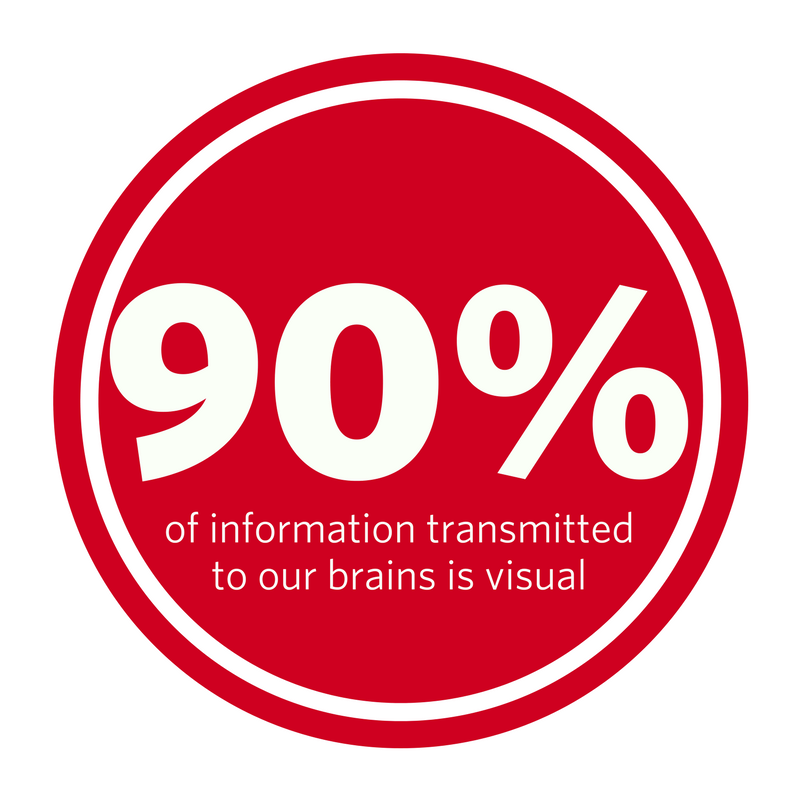
1) 90% of information transmitted to our brains is visual, this is because visual information is easier for us to absorb.
2) Our brains are wired to latch onto visuals, so using an exciting infographic increases the chances of your audience reading the information.
3) People are more likely to read, understand and remember what they see in an infographic, compared to a paragraph of text.
4) Infographics are versatile. When designed correctly, they can be used in a document or presentation, shared on social media or printed out as a poster.
Things to remember…
Get the data and check it. Are the statistics and figures accurate? Is your source credible?
Pin down the layout before designing – plan the space you’ve got to work with. It’s important that your infographic flows well and each section has enough space to illustrate your point.
Know your message – The message of the information must link back to the overall infographic design, so know what it is you want to say.
Have a tone – Your infographic should have a tone of voice that links with the message. It may be fun, serious or informative – but should connect with the overall message and design.
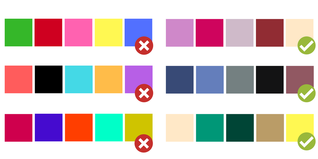
Be picky with your palette – Colours matter, they should complement the design and make the whole infographic easy to read. We suggest a 3 to 5 colour palette that’s easy on the eye. Here’s some examples of colours that work, and colours that don’t!
Consider the font – Just like colour, your font needs to be clear and concise. People will be put off quick if they can’t read the information quickly.
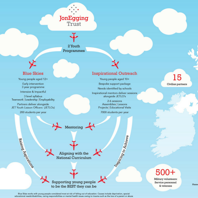
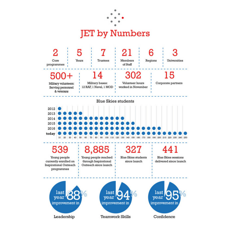
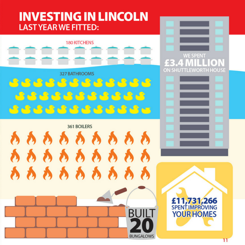
Here’s a couple of infographic designs we have worked on…
Interested in using an infographic in your next project? We can help to create a design that gets your message across in a creative yet professional way.
