How to set up artwork for print
Here at Visual Print & Design, we want to make sure that you receive your print at the best quality possible. An important part of the process that has a huge influence on the final product is the way your artwork files are set up and sent over to us. We will always try and look out for any problems with your files and let you know, but sometimes things do slip past our expert eyes! To help reduce issues with your print, we have put together this blog to guide you through common issues and how to resolve them to get the best out of your print.
Setting up your design files
The first step to making sure your files will print the right way is ensuring your design file is set up correctly from the get-go. The most common programs used to design print are InDesign and Quark. These have specific programming aspects that help ensure quality. Other programs such as Adobe Photoshop and Adobe Illustrator can also be used to make print files.
Paper Sizes
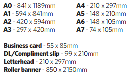
Setting up the correct page size is important to prevent the artwork having to be stretched or reduced in size in order to fit onto the sheet. Here are the sizes for general print:
Bleed
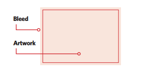
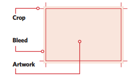
For the majority of print work, we require documents to have a 3mm bleed area all the way around. This is to make sure the quality remains during the trimming process, as guillotines can wobble anywhere up to 3mm. Failing to add bleed can result in the white of the paper appearing at the edge of your design. Bleed has been set up correctly when background colours and images that are at the edge of your design, run into the bleed area. Most desktop publishing programs will include a bleed setup option when setting up the pages for design, however, with other software you may have to enter the extra 3mm manually. For example, an A4 poster might have to be entered as 216 x 303mm.
Colour format
Printing presses differ to most desktop printers in the ink that is used. Rather than RGB (red, green and blue) used for desktop printers and computer monitors, printing presses use a mixture of cyan, magenta, yellow and black (CMYK). It is important to set up your design document in the CMYK colour format to avoid unexpected results on the final printed version, often referred to as ‘colour shift’.
Pantones
Sometimes a corporate branding or special print project may require the use of a fifth colour to achieve brand consistency. These extra colours are known as Pantone. It is important to set this fifth colour up in your design rather than a mixture of CMYK to make sure we are able to indemnify and print these parts in the correct ink.
Images
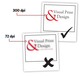
Most of the issues that we see with images can really distract from the overall design. Resolution is the main problem. To make sure crisp images are printed, it’s best to use images that have a resolution of 300dpi (dots per inch) and are in the CMYK colour format. The majority of images on the internet are not up to standard for print as they tend to only have 72dpi as they are only being used for screen. Stock images from image banks or photos straight from cameras tend to have the best quality for print.
Rich black
Common sense would argue that using 100% black in a design would print out as a solid black colour. However, the world of printing sometimes isn’t that straight forward. If you design has a solid black area, on screen it can look dark enough but when it is finally printed it might look a bit more muted or even grey. This happens because rich black is needed to make the colour stand out more. This can be achieved by using a mixture of all four colours to increase the level of ink in the black and create a darker, richer tone. There is no standard mixture that can be used, but it’s important to avoid using a mixture that is over 240% as it can lead to over inking.
Over inking
Over-inking happens when a mixture of CMYK has values too high and creates too much ink in one area. This then leads to the colour being darker than planned. It can also lead to longer drying times and offsetting, as well as a loss of detail in the artwork.
Overprinting and knockout
Overprinting and knockout are two methods used in design to create interesting features but if they are not used correctly, they can hinder a great design. Overprinting is the process of different layers printed over each other. Knockout, on the other hand, prevents lower layers being printed. Most designs will have overprinting turned off and all elements set to knockout.
A couple more things
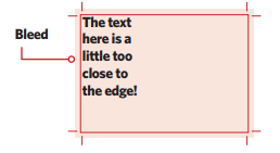
It is good practice to ensure that important design elements, such as text, are at least 5mm from the edges of the final size they will be trimmed to. Having these elements too close runs the risk of important information getting trimmed off during the guillotine stage.
Ensure that text doesn’t go below 8pt because it will be difficult to read.
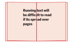
When designing a booklet or brochure, it is important to remember that it will be hard to line up separate pages to the level as shown on screen. It is advised to avoid having text and images that run across the centre of a page unless it’s the centre page spread that doesn’t feature alignment issues.
Now that your artwork is designed, it’s time to save the files ready for us to work with and process into print! These last steps will help to make sure that your files are all ready to go.
Crop marks
Crop marks help us to identify where we need to trim the artwork. They also allow us to make sure that the bleed has been set up correctly, as any text or images that look like they will get trimmed off can be highlighted.
Pages
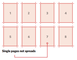
It’s most likely that when you are designing your artwork in page spreads to make sure your layout across the pages remains consistent. However, when it comes to print we require pages to be sent as single pagination to allow us to impose the artwork correctly on the print sheets.
Outlined text
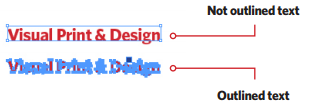
When using a specific font that may not be standard, it is sometimes good practice to make sure that the text is outlined in the design file. This is to ensure that the text doesn’t change in case the original font isn’t embedded.
Special finishing
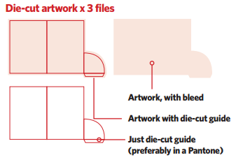
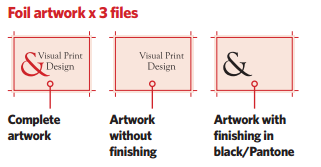
If you have ordered a product with a special finish such as spot UV, foiling or die cutting, you will need to submit a few different file types. The first is your artwork submitted as standard. The second file would then feature your artwork with the special finishing areas placed over the top. It is best to submit this set up as a fifth colour to prevent it being printed in case the wrong file ends up going on the press. The final file required will highlight just the finishing areas without being imposed on the artwork.
Saving your file
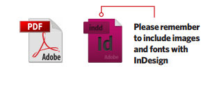
The best file format to send over your artwork is PDF. This method preserves the quality of images, colour formats and embeds the majority of text automatically. If you are submitting the original design files you must remember to ensure all images, fonts and links are also submitted.
Sending your file
You can send your file over to us in a variety of different ways. The quickest method is email, but remember that some email inboxes have trouble with files over 10MB. In this case, we would recommend using third party methods to send larger files for free. They provide you with an email receipt when files are sent and downloaded and we receive a link to the artwork that we then download.
