Roller banner design tips
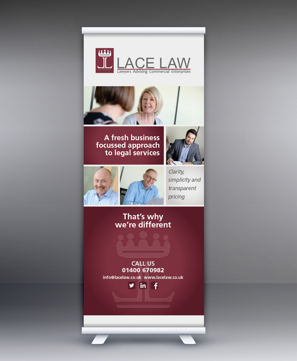
Roller banners or ‘pull up’ banners are a common piece of large format print used by companies looking to stand out at exhibitions. These compact banners are also used to make an impact in office spaces or receptions. For a roller banner to achieve maximum impact, the design is crucial. When setting out on creating a roller banner design, you should approach it the same way you would with any other printed material. Using a banner is another way to promote your company and message, so it is important to keep branding consistent.
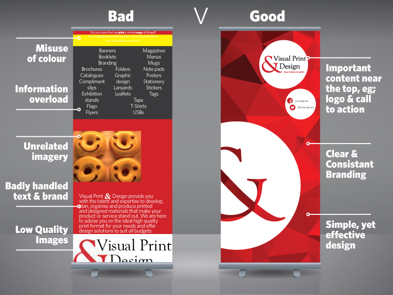
To help, we have kept it simple and created two examples of roller banner designs, good vs bad. One is to show you what to avoid when designing a banner. The other is to inspire you and show how you can easily create a beautifully designed banner by following some simple tips.
First, let’s point out what to avoid! At trade shows and exhibitions, roller banners are normally placed behind tables, which annoyingly leaves only about 50% of the overall banner visible. Now, imagine all of the important information about your company is in the lower section of the banner – it would be missed completely!
It is a bad idea to overload a banner with text and paragraphs, less is more! People do not have time to stand and read a lot of text. They want to know quickly who you are or what you do, in order to work out if they should stop at your stand or not.
Low resolution images can instantly spoil an otherwise creative design. It also doesn’t help to use images that don’t relate to your company brand or the message you are trying to get across.
So, what tips can you follow to make your design stand out? Clear branding and layout for starters. Put your logo at the top of the banner and use the upper section to display your company name and key message. Having these items at eye level will grab people’s attention as they walk past your stand and make them want to stop.
Keep things flowing by directing the line of sight from left to right. Words should be kept to a minimum as you can always include more information in company leaflets or brochures.
If you are using images on your design, make sure they are high resolution – 300dpi to be precise. Images straight from the camera work best, or failing that there are numerous free image banks you can use. Don’t be afraid to use colour on your banner. Not only does colour help you stand out, it also links your banner to existing marketing material by keeping branding consistent.
Finally, don’t forget your call to actions! People need to know how to get in touch if they need more information. Place your company CTA’s to the top of the banner, near the logo and company name.
To round up, here’s our banner examples to remind what to include and what to avoid…
