Top 5 design trends for 2018
1. Authentic Photography
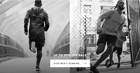
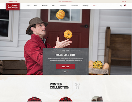
The days of perfectly staged photographs with business men and women shaking hands staring into the camera or fashion models posing in unnatural circumstances that no woman would ever find themselves in, (with a sober mind at least) are all but gone.
With the rise of Instagram and consumers looking for opinions and approval ratings from friends and family, rather than the product creator themselves, audiences are eager to see authentic and natural photography. Staged ‘stock photos’ are seen as wooden and painfully fake. Capture someone in a natural way and your product and/or service will most likely receive a warmer reception from your target audiences.
Image: Adidas
Image: Stormy Kormer
2. Depth, depth and more depth
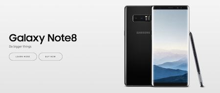
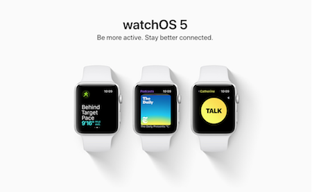
It’s fair to say that shadows are back in. 2018 has seen a massive resurgence in the use of shadows on product designs in particular. It’s important to emphasise that the shadows are predominately used on objects, not text. This is often seen as an amateur design choice from many.
However, the shadows in 2018 are large and soft, giving the products a subtle depth, unlike the previously overused “drop-shadow” which is harsh and distracting.
Other reasons for the use of shadow is to establish visual dominance on print between text, objects and calls to action. Which object do you want to be the main focus? Once you’ve figured that out, experiment with a shadow and you’ll soon see how design elements start jumping out from the screen!
Image: Samsung
Image: Apple
3. Double light/duotone
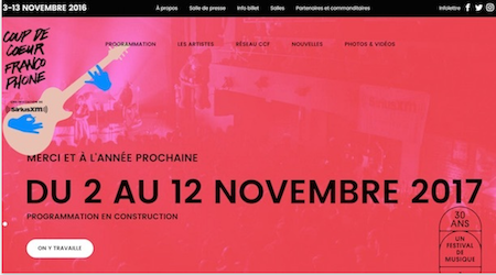
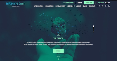
I’m going to hazard a guess that you’ve used Spotify before. If you have, then you would have seen their duotone approach to their branding at some point or another. The bold, eye catching colours allow designers to create backgrounds that combine photography (added bonus points for authentic) with colour that doesn’t make overlapping text difficult to read.
Designers can also tap into the other hugely popular trend of gradients (most likely thanks to the Instagram rebranding) to produce artwork that blends photography into duotone similar to a gradient.
Image: Coup De Coeur
Image: InternetumInternetum
4. Integrated typography/3d photography
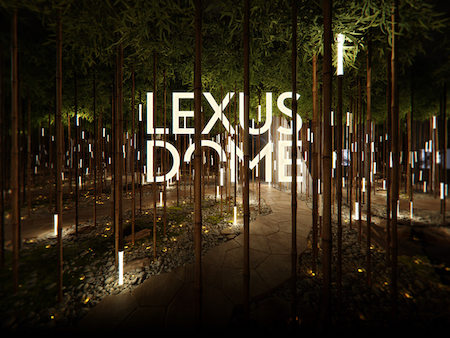
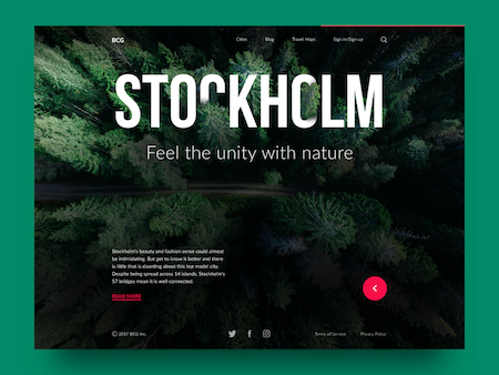
It could be said that the rise of design choices such as gradients and soft shadows, has meant audiences are after ‘cleaner’ designs. In the case of integrated typography, it blends image and text in a way that isn’t just ‘slapped on’. No, instead the two are entwined into each other in a smooth, and often effortlessly looking fashion that looks clean and professional.
If you were to put on your analysing glasses, say for example you’re a company working to restore rainforests and you integrated your logo into the trees, even at first glance it instantly tells the audience that your companies ethos is centered around the environment.
3D typography tick’s similar boxes, also often incorporating the soft shadow trend to create more depth within the image.
Image: kloudymail.com
Image: tubikstudio.com
5. Colour – Gradients
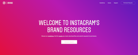
With industry powerhouses such as Instagram, Apple and Spotify taking on board ‘modern gradients’, it was only a matter of time for the rest of the world to follow in their footsteps. These modern or ‘soft’ gradients have allowed designers to make the most out of their vibrant colour transitions without stepping into the ‘abstract’ design space.
Gradients are incredibly versatile in their application. Experiment with your brand identity! You might find that your photography works perfectly when applied to a gradient…make it authentic and you’ll be well on your way to a professional, eye-catching brand!
Image: Instagram
Image: Spotify
Added extra
Colour is extremely important when talking about anything print. We’ve spoken a bit about how you can adapt your colours, i.e. incorporating duotone colour or using soft gradients. However, it’s worth pointing out that the colour of the year for 2018 has already been announced. Drum roll please….
Ultra Violet! The light, soft purple lends itself incredibly well to gradients and in the words of Laurie Pressman, Vice President of Pantone Colour Institute,
“The Pantone Colour of the Year has come to mean so much than ‘what’s trending’ in the world of design; it’s truly a reflection of what’s needed in our world today.”
Beautifully said Laurie, the world does indeed need more parma violet sweets!
Image: Pantone
If you have a design and/or printing job that you would like some help on, give us a call or drop us an email, we’re always available to help in any way we can!
